

Hello, Hola and Namaste!
Today we are going to achieve what you see in the article cover image. Basically, we would animate the button text to smoothly slide up and down and show a different text when one hovers over it.
Without further ado, let's dive in.
Step 1: Add the html structure
Needless to say that we would need two different text values for button.
The primary text(New Blog) would hold the current information while the hidden text(Read it now!) would hold the value shown on button hover.
Here is the code so far:
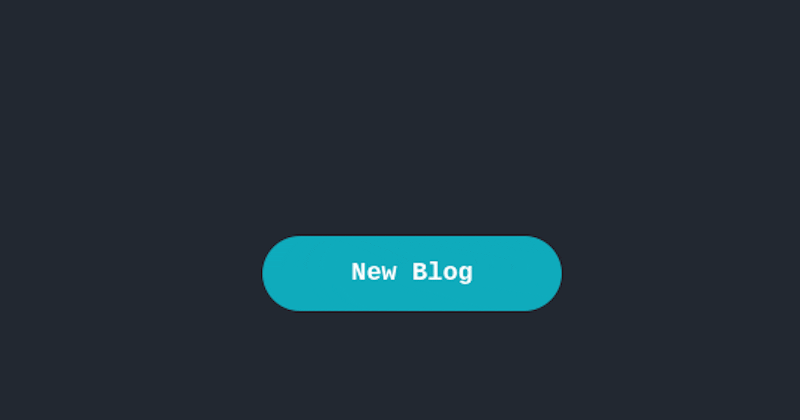
<div class="btn blog-button">
  <div class="primary text">New Blog</div>
  <div class="secondary text">Read it now!</div>
</div>
.btn {
  width: 200px;
  height: 50px;
  background-color: #0fabbc;
  border-radius: 25px;
  color:#fff;
  font-size:18px;
  font-weight:bold;
  font-family: "Lucida Console", "Courier New", monospace;
}

Step 2: Initial state (No Hover)
Right now both the text values are stacked against each other in the tiny button box. Let us use the position property to separate them.
.btn {
  width: 180px;
  height: 45px;
  background-color: #0d7377;
  border-radius: 25px;
  position: relative;
}

.text {
  width: 180px;
  height: 45px;
  position: absolute;
}

.primary {
  top: 0px;
}

.secondary {
  top: 80px;
}

When you use position: absolute;, it positions itself relative to the nearest positioned parent. If you look at the above code and the image, we gave the .btn the position of relative and positioned the children divs absolute.
So now whenever you try to change the position of the children elements(.secondary and .primary), they would move with respect to the .btn div and not body.
Step 3: Hover state
If you look at the code above, you'd notice that we have given the .secondary class a top value of 80px. That's our button text to be displayed on hover. When one hover over the button, the top property should be 0 so it sits inside the button box.
Similarly at this point, we want the existing text("New Blog") to clear space for the secondary text so we would move it up by setting the top to -80px. Let's see it in action.
.btn:hover .primary {
  top:-80px
}

.btn:hover .secondary {
  top:0px
}

Here's the complete code used so far for your reference. But wait, isn't something missing here?
Ohh yeah, the transition doesn't look very smooth. Plus why the other text is still visible. Let's fix it.
Step 4: Sprinkle some animation here and there
Right now, the sliding up and down behaviour is instant. Let's use the CSS transition property to control the speed of this slide up/down behaviour.
Additionally, time to get rid of the unwanted text. We only want to show whatever text is inside the button box with the .btn class and so we would use overflow:hidden to hide that text. Let's see it in action:
.btn {
  overflow:hidden;
}

.text {
  transition: top 0.7s;
  -moz-transition: top 0.7s; // Firefox
  -webkit-transition: top 0.7s; // Safari and Chrome
  -o-transition: top 0.7s; // Opera
  -ms-transition: top 0.7s; // Explorer
}

The above code snippet is simplified to only show the code relevant to this section. You can find the final code here for all the css styling that I have used.
This brings me to the end of this article. I enjoyed animating this button and writing about it. I hope this brings the same joy to you when you read and try it on your website.
My comment section is open to your feedback. If you want to chat over twitter, you can find me here.
Concluding this article with the usual request: Like, share and comment. It would mean a lot to me. 🙂🙂
Until Next time!